
Valley Metro Ticketing Kiosk
Role: UX Researcher, UX Designer, Usability Engineer | Kiosk Screen - 2023 | Figma, Blender | 4 months
Valley Metro is the regional public transportation system serving Phoenix and Tucson in Arizona. It encompasses a comprehensive network of buses, light rails, and paratransit services, providing convenient and sustainable transportation options for residents and visitors.
Defining the Problem
As frequent Valley Metro users, we observed several usability issues with the ticketing kiosk system. Valley Metro's ticketing kiosk system serves as a crucial touchpoint for passengers seeking a hassle-free way to purchase tickets, check schedules, and obtain transit information. However, as with many public transportation systems, there were inherent complexities and pain points within the existing system that required attention. Long wait times, confusing navigation, and a lack of accessibility were some of the critical issues reported by users.
Hence, the objective of the redesign of the Valley Metro Kiosk was to streamline the ticket purchasing process, improve discoverability, and reduce wait times, making it easier and more convenient for users to utilize public transit services.
We aimed at improving the product as a whole and not just redesigning the UI and UX parts of the kiosk.
Not only did we redesign the interface of the kiosk, but also gave the physical product (outer body of the kiosk) a fresh new look, added features, and focused highly on the overall user interaction with the entire system.
Is this really something everyone faced?
Before jumping on the high horse and start solving the problem, we decided to conduct interviews with actual users to figure out if this was a real problem faced by Arizona residents. We interacted with many passengers outside the light rail stations and Tempe Transit Centre (TC) to understand their pain points, if any.
Why light rail stations and Tempe TC?
Because kiosks are placed only outside light rail stations and at the Tempe TC where all the Valley Metro vehicles end their trips.
And as we thought... passengers were frustrated while using the kiosk. Here's a summary of the pain points we found out from this session:
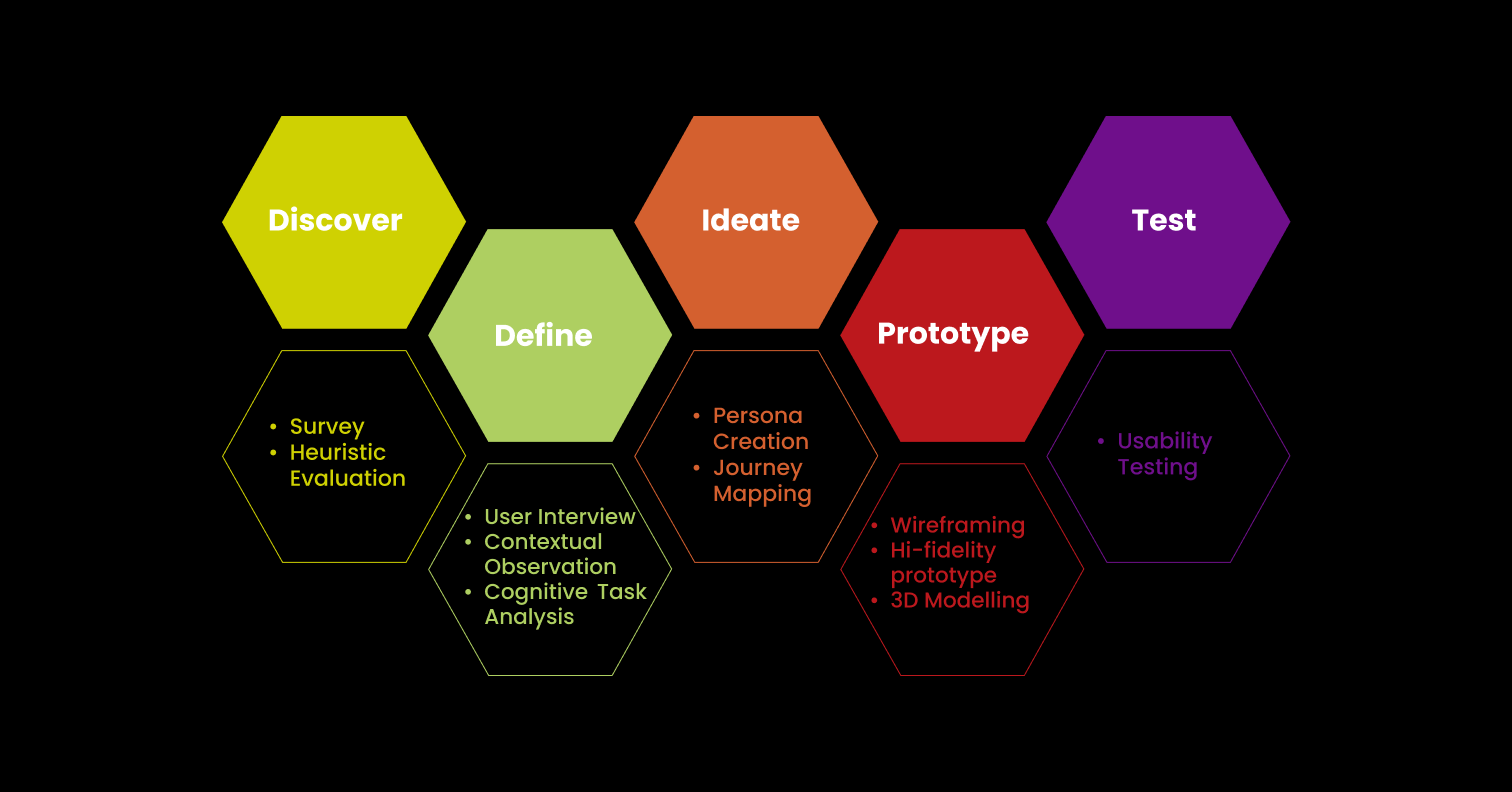
Design Process Overview
The users that participated in the survey, interview, task analysis,and usability testing were actual users selected on the basis of:
1. frequency of travel with Valley Metro
2. demographic factors such as age, language, disabilities (if,any)
3. experience using the kiosk
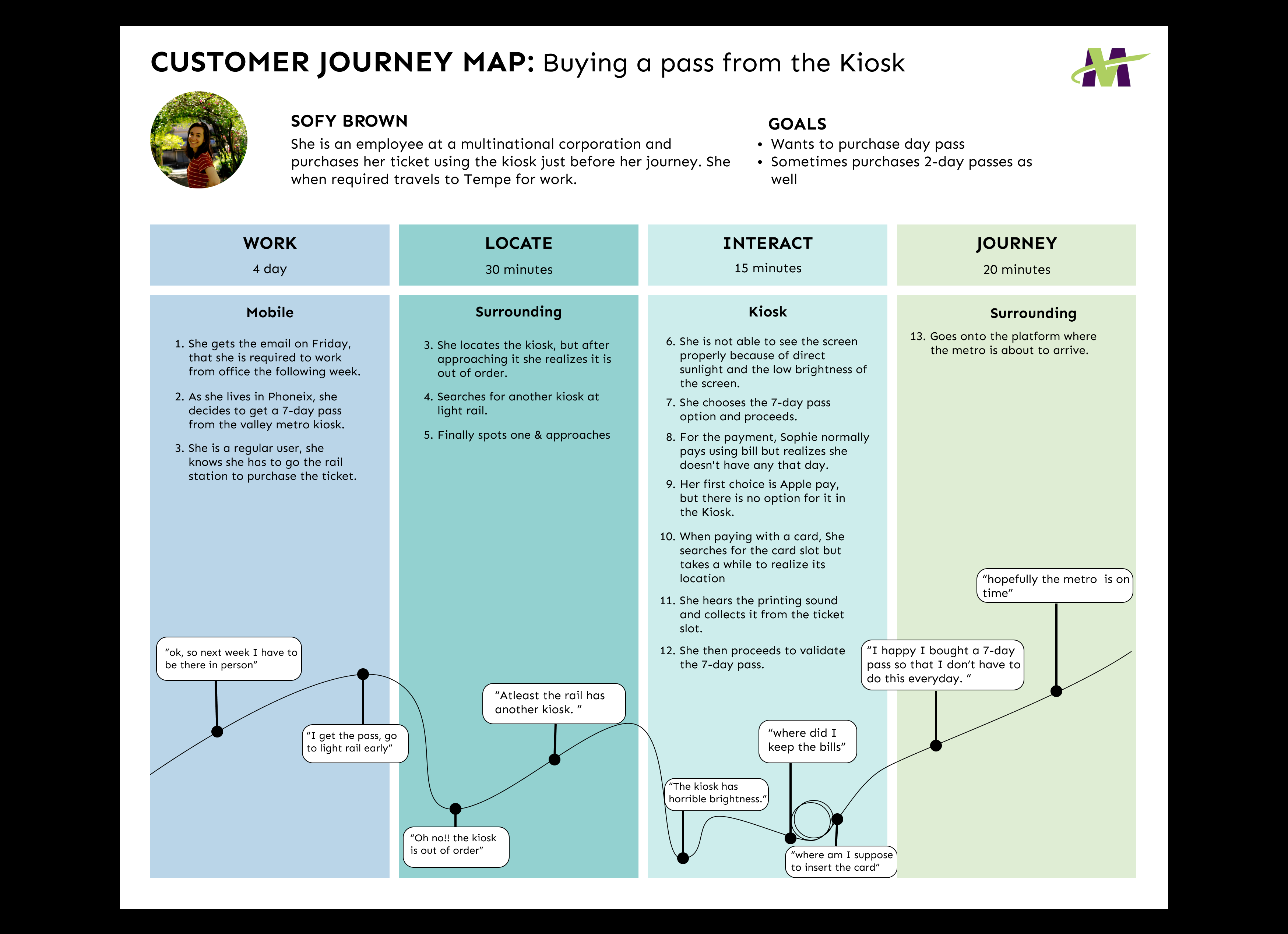
After analyzing and synthesizing the user reasearch data, we found a pattern and an average user interation looked something like this:
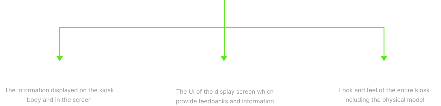
How we solved the problems?
We found too many pain points and design defects from the Discovery phase. It was necessary to segregate the issues and work on each of them in iterations to produce quality product.
After brainstorming for a while, we ended up dividing all the issues in 3 main categories.
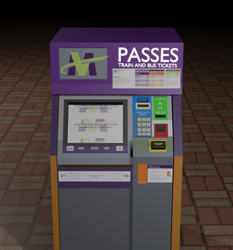
Labels and Instructions - I
-
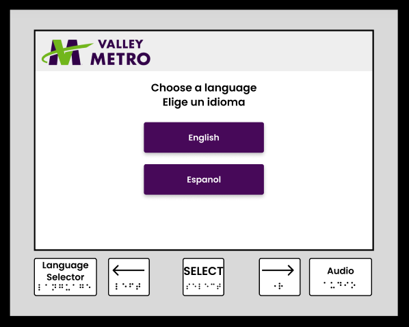
The button configuration on the screen consists of buttons numbered from 1 to 6, alongside two buttons labeled "E" for language change and a speaker icon for vision-impaired users. The users didn't understand the meaning behind these labels since they are not intuitive and have been ignoring them every time they use the kiosk. Consequently, users with disabilities and those unfamiliar with English faced significant barriers to accessing the kiosk since the default language was English, unless otherwise changed.
-
Recognizing the importance of clear labeling, we rebranded the buttons as "Language Selector" and "Audio" to enhance comprehension. Furthermore, we redesigned the user flow to include a language selection prompt at the beginning of the purchasing process to make the system easily accessible. Two language options were provided since majority population includes English and Spanish speakers.
Labels and Instructions - II
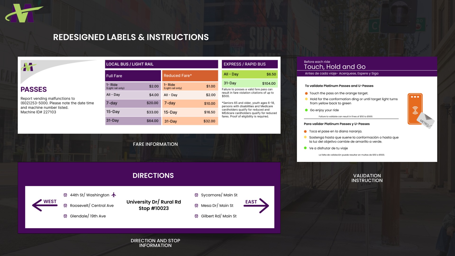
-
The kiosk was found to be lacking crucial information, including eligibility criteria for a reduced fare, direction details, and pass validation instructions. This created cognitive overload for users during task analysis. To address these issues, we designed information labels to be displayed on the kiosk.
-
None of us were content editors, but we tried rewriting instructions in a clear and concise manner and sent it to a few users to confirm that it is easily understood by the novice as well as experienced users.
-
While accessing the kiosk, users are generally in a rush to catch the train/ bus and they don't prefer standing in a queue and patiently purchase a pass. Such a mental model calls for only the important information to be fed to the audience as soon as possible.
Hence, the metrics to be showcased in each of these labels were carefully selected from the user data such that it brings maximum value to the users and to not let the crowd accumulate near the kiosks.
User Interface - I
-
Users encountered cognitive difficulties due to lack of error recovery and complex navigation. They found it overwhelming to enter all the information correctly at once, as there was no back button to edit previously entered details. To address this issue, we redesigned the screen with a more intuitive navigational flow.
-
The updated design allows users to easily edit or cancel the process at any point, providing them with greater flexibility and alleviating cognitive burdens during data entry.
User Interface - II
-
The kiosk screen lacked visual hierarchy, hindering information prioritization and navigation. To address this, we implemented a proper visual hierarchy system for the screen interfaces.
-
While selecting the colors and typography, we made sure that it is consistent with the VM's brand identity.
-
Next, we organized ticket options, fare details, and other relevant information into logical groups of like elements to promote discoverability.
-
Considering the Customer Journey Map, we redesigned the user flow. For instance, user actions were divided into several pages. It guides users step-by-step from selecting a language, fare type, pass quantity, and so on.
-
The prominent user action was ticket purchase which was effectively emphasized to draw users' attention. Similarly, information was differentiated using typography and colors based on its importance to the users achieving their goal.
What metrics did we consider?
These improvements aimed to enhance user understanding, streamline decision-making, and improve overall navigation on the kiosk interface. These are some of the main use cases of the kiosk screen:
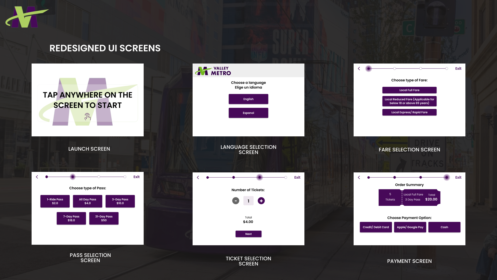
These screens were designned with a focus on utility over aesthetics.
Physical Product
-
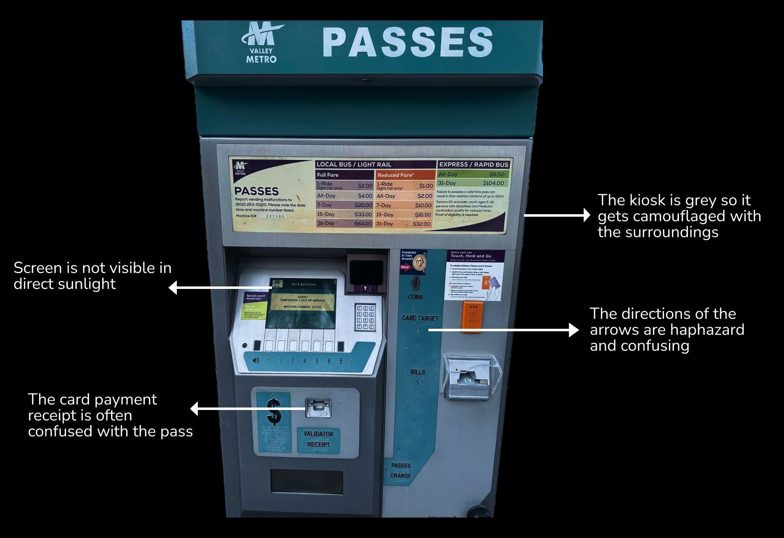
There were major accessibility issues in the physical product and all the users faced them in at least one of their interaction with the kiosk.
What accessibility issues were identified?
-
The main purpose behind using this system is to get the travel passes. The pass dispenser slot is situated at the bottom, way below the eye level. Whenever a pass comes out of the slot, no visual cue is added to grab users' attention. Hence, many users mistook card payment receipts with the passes and left the kiosk without actually collecting them.
-
Key actions such as coin and bills input, card tap for validation etc. are placed randomly throughout the kiosk. It adds to the mental load in discovering where the desired slots are because similar elements are not grouped together.
-
To add to the confusion, improperly-directed arrows have been depicted below each of these slots.
How did we solve them?
-
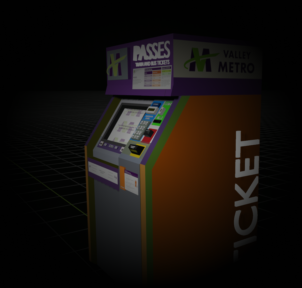
We relocated the ticket dispenser slot to a more prominent position at eye-level. By moving it to a more accessible location, users can easily spot the slot without needing to search for it. To further assist users in locating the slot, we introduced a new feature - an attention-grabbing red light that blinks around the slot each time a pass is generated to improve it's discoverability.
-
All slots requiring user actions were relocated to a single area the screen. By consolidating these slots, users can easily locate and interact with them without having to search throughout the kiosk.
-
Similar elements were grouped together, utilizing space effectively. For example, slots for bills and coins were positioned together, as well as slots for card validation tap and its corresponding instruction label.
-
Colors were strategically chosen to align with users' mental models, , making the system more intuitive. Each slot was color coordinated based on its purpose. For instance, the slot for bills and coins was colored green to resonate with the universal association of money. The ticket slot was made yellow to grab users' attention, highlighting its significance.
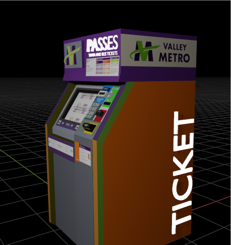
As you can see, we even changed the grey color of the kiosk to orange so that it doesn't get camouflaged with surroundings and to improve its visibility!
Enjoy the 3-D model we made to flex our marketing skills!
Let’s connect!
 yashviihp@gmail.com
 yashvihpatel
 yashviiiiipatel